
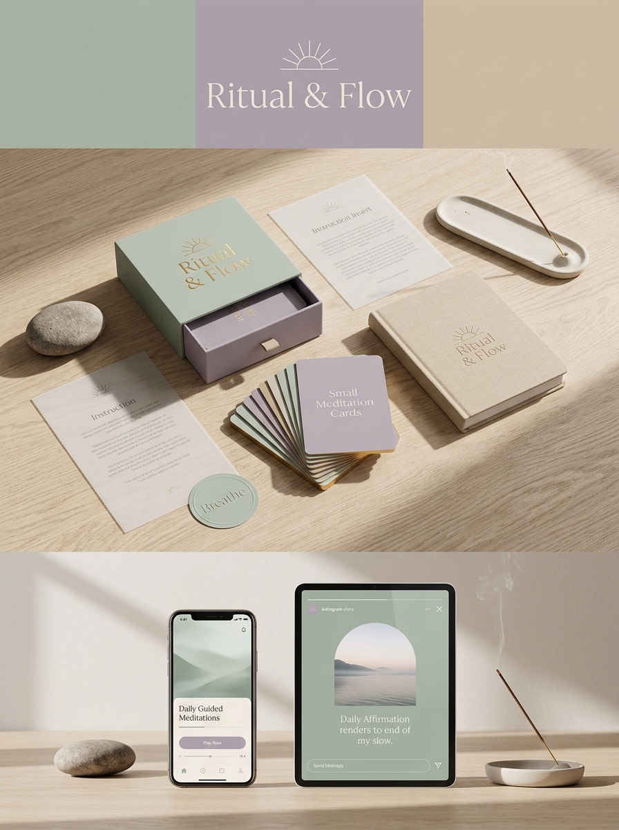
Creating a mindful experience begins long before a practitioner closes their eyes; it starts with the tactile and visual interaction with the product. For small format daily meditation packaging, design aesthetics must bridge the gap between functional portability and spiritual tranquility.
Compact kits-whether housing affirmation cards, aromatic resins, or sensory tools-require a structural layout that prioritizes intuitive ease. By integrating soft, organic color palettes and sustainable materials, brands can evoke an immediate sense of groundedness. Strategic typography and tactile finishes, such as raw linen textures or soft-touch laminates, serve to anchor the user in the present moment. Understanding these core principles of minimalist structure and intentional artistry is vital for transforming simple containers into sacred objects for modern daily rituals.
Defining the Essence of Compact Meditation Packaging
The small format in daily meditation literature is a deliberate design choice prioritizing portability and accessibility. Compact meditation packaging transforms spiritual guides into versatile companions, allowing users to integrate mindfulness seamlessly into their busy schedules. Whether tucked into a pocket or a small travel bag, these editions ensure that profound insights are always within reach.
This minimalist approach to packaging emphasizes the essence of the content, stripping away bulk to focus on daily contemplative practices. By utilizing a compact footprint, these books serve as tactile anchors for presence and intention throughout the day. The small format effectively bridges the gap between traditional study and on-the-go spiritual nourishment, making daily meditation a truly mobile, accessible experience for the modern practitioner.
The Psychology of Color in Mindful Design
In the realm of Daily Meditations Small Format editions, color psychology is a fundamental element that shapes the practitioner's experience. Mindful design utilizes specific palettes to evoke tranquility and focus within a compact, portable space. Cool tones like soft azure and sage green are strategically chosen to promote emotional stillness and lower stress levels during reflection.
Conversely, warm neutrals and earthy ochres provide a sense of grounding and stability. Because small-format guides are intended for frequent, everyday use, the visual harmony of the pages is crucial to prevent sensory overload. By integrating these intentional color choices, mindful design transforms a simple meditation tool into a sensory anchor, helping users achieve mental clarity and spiritual balance quickly, regardless of their environment.
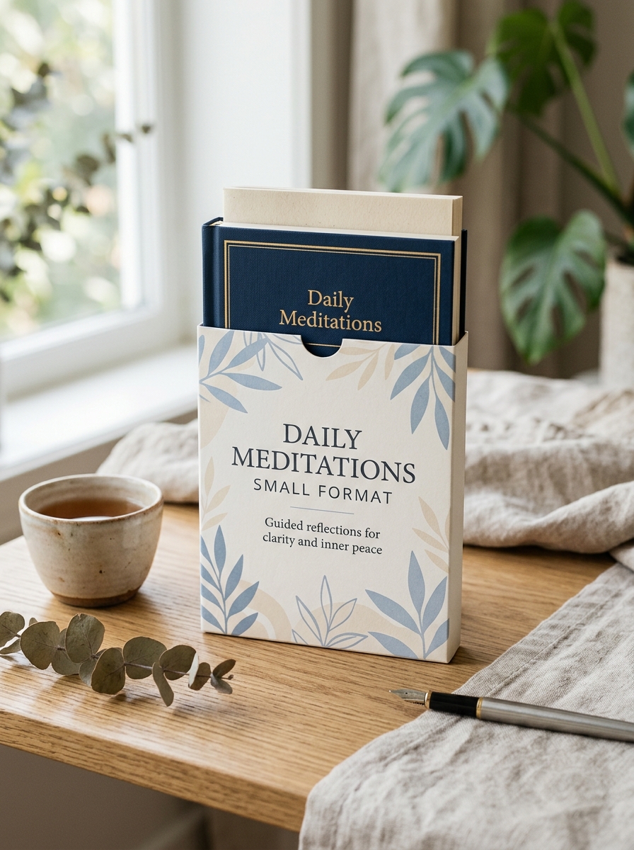
Typography Choices for Clarity and Inner Peace
Selecting the right typography for Daily Meditations Small Format editions is essential for fostering a serene reading experience. To achieve maximum clarity and inner peace, designers prioritize high-legibility typefaces that reduce cognitive load during contemplative moments.
- Serif Typefaces: Classic serifs like Garamond or Sabon provide a grounding, traditional feel, guiding the eye smoothly across compact pages.
- Optimal Leading: Generous line spacing creates visual "breathing room," preventing text from feeling cluttered in a portable size.
- Scale and Contrast: A balanced font weight ensures readability under various lighting conditions without sacrificing the book's intimate aesthetic.
By harmonizing balanced letterforms with intentional white space, the typography serves as a silent guide, ensuring every meditative word resonates with tranquil precision and effortless focus.
Maximizing Visual Impact on Small Surface Areas
Designing for the Daily Meditations Small Format requires a strategic approach to ensure spiritual content remains both accessible and impactful. On constrained surface areas, clarity is paramount. By prioritizing high-legibility typography and generous white space, designers can prevent visual clutter, allowing the reader to focus entirely on the meditative message.
To enhance the user experience in compact editions, consider these essential design principles:
- Visual Hierarchy: Use bold headings and concise body text to guide the eye naturally.
- High Contrast: Ensure a strong distinction between text and background for readability in various lighting conditions.
- Minimalist Elements: Incorporate simple iconography or subtle motifs that anchor reflections without overwhelming the layout.
This focused design philosophy transforms small-scale pages into expansive tools for mindfulness, ensuring every square inch contributes to a calm, reflective reading experience.
Tactile Finishes and the Sensory Unboxing Experience
The Daily Meditations Small Format edition is engineered to engage the senses long before the first word is read. This curated unboxing experience focuses on tactile finishes that foster an immediate emotional connection. Featuring premium elements such as soft-touch lamination, linen-textured covers, or elegant gold foiling, the physical book serves as a grounding tool for mindfulness.
The compact size provides a satisfying weight and ergonomic grip, making it a perfect companion for daily rituals. Every detail-from the smooth grain of the acid-free paper to the subtle scent of quality ink-is designed to elevate the act of reading into a holistic sensory journey. By prioritizing high-quality materials, this small-format edition transforms a simple book into a cherished meditative object that enhances your spiritual practice through touch and sight.
Symbolism and Minimalist Imagery for Daily Practice
In the context of Daily Meditations Small Format editions, the integration of symbolism and minimalist imagery is a deliberate design choice to enhance spiritual focus. These compact guides use clean, understated visuals to act as mental anchors, helping practitioners bypass cognitive clutter and enter a state of mindfulness more rapidly.
Minimalist design facilitates daily practice by prioritizing essential symbols-such as a single lotus, a rising sun, or geometric shapes-that represent complex philosophical concepts. This visual shorthand is particularly effective for portable formats, where limited space requires high-impact clarity. By engaging with these streamlined images, you create a consistent psychological trigger that fosters peace and intentionality. Utilizing such imagery ensures that your meditative journey remains centered on internal reflection rather than external distraction.
Material Selection for Durability and Sustainability
Our Daily Meditations small format editions are engineered for both longevity and environmental stewardship. To withstand frequent daily handling, we utilize FSC-certified, acid-free paper that resists yellowing, ensuring your insights remain preserved for decades. The compact design features reinforced smyth-sewn binding and scuff-resistant covers, providing the structural integrity necessary for a portable spiritual companion that travels with you.
Sustainability is integrated into every layer of production. By prioritizing recycled fibers and vegetable-based inks, we reduce our ecological footprint while maintaining a premium tactile experience. This thoughtful material selection ensures that your meditative practice is supported by a product that is as resilient as it is eco-conscious, perfectly bridging the gap between high-quality craftsmanship and planetary care.
Balancing Negative Space with Essential Product Information
In the design of Daily Meditations Small Format editions, achieving a harmonious balance between negative space and core content is vital for user engagement. Negative space, or whitespace, is not merely empty area; it acts as a functional element that reduces cognitive load, allowing the reader to focus on the spiritual essence of the text.
Effective layout strategies prioritize essential product information-such as daily quotes, reflective prompts, and dates-without cluttering the limited canvas. By utilizing generous margins and clear typography, the design mirrors the tranquility of the meditation process itself. This minimalist approach ensures that every word carries weight, transforming a compact physical format into an expansive mental experience that promotes clarity and mindfulness.
Functional Design for Portability and Daily Integration
The Daily Meditations small format is specifically engineered to bridge the gap between spiritual practice and a busy lifestyle. These compact editions prioritize portability, fitting effortlessly into pockets, purses, or briefcases. This intentional sizing ensures that daily reflections are never restricted to a single location, allowing for consistent mindfulness during commutes, travels, or work breaks.
Beyond its physical dimensions, the functional design emphasizes durability and ease of use. With legible typography and a lightweight structure, these books are optimized for frequent handling and quick reference. By making inspirational content highly accessible, the small-format design supports habit formation, transforming any environment into a sanctuary for reflection. This integration of form and function makes daily spiritual growth a practical, mobile reality for the modern reader.
Creating Emotional Resonance Through Cohesive Branding
For the Daily Meditations Small Format series, cohesive branding is the bridge between a product and a personal ritual. Because these meditations are designed for intimate, handheld use, every visual element-from soft color palettes to minimalist typography-must work in harmony to evoke a sense of peace.
A consistent brand identity builds psychological trust. When the design language remains stable across every edition, it signals reliability and safety to the practitioner. This visual continuity ensures that the moment a user interacts with their meditation tool, they experience an immediate emotional shift toward mindfulness. By aligning the aesthetic experience with the spiritual content, the brand transcends functionality, becoming a cherished emotional anchor that resonates deeply within the user's daily life.
Leave a comment