
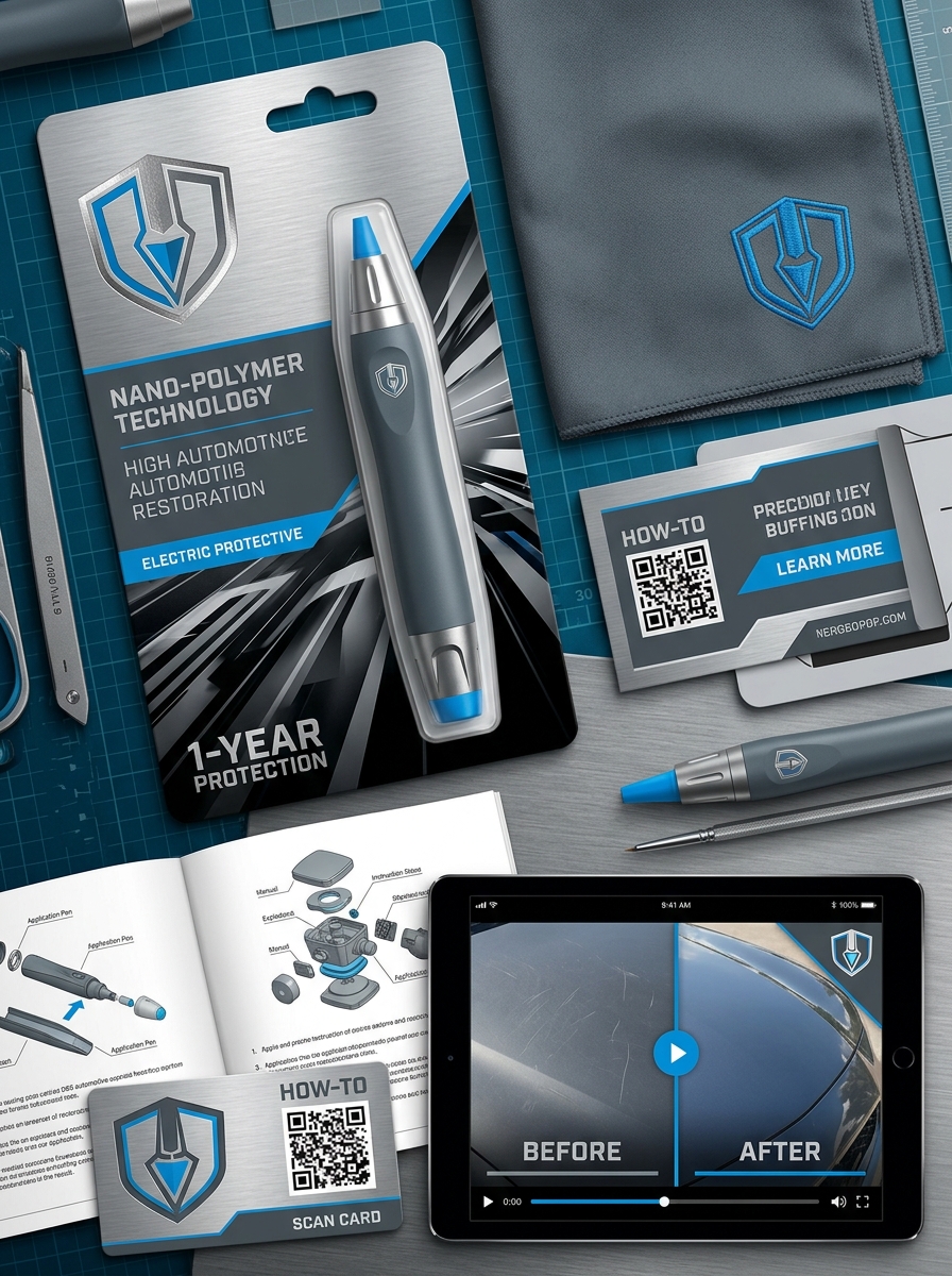
Effective packaging design for a scratch remover pen transcends mere containment; it serves as the primary bridge between automotive innovation and consumer trust. To capture immediate interest, manufacturers must prioritize aesthetic principles that communicate precision, reliability, and professional-grade results through every visual element.
Establishing a cohesive visual identity is essential for differentiating touch-up tools in a saturated market. This process involves a strategic blend of high-impact typography, intuitive color theory, and minimalist layouts that emphasize the product's functional efficacy. By mastering these core design strategies, brands can significantly enhance shelf appeal and reinforce long-term loyalty. Transforming a standard utility item into a premium consumer solution requires a deep understanding of how graphic clarity and brand messaging intersect to drive purchasing decisions in the automotive care sector.
Defining the Visual Language of Surface Restoration
A scratch remover pen acts as a precision instrument that translates complex material science into a seamless visual repair. By utilizing UV-activated resins and advanced micro-filling polymers, these pens address the "visual language" of restoration-specifically light refraction and surface leveling.
When a surface is scratched, light scatters, making the damage visible. The restoration process involves filling these voids with a clear, high-gloss formula that mimics the original automotive clear coat. This synchronization of pigment and texture ensures that the repaired area reflects light uniformly. Semantically, this process focuses on restoring optical depth and structural integrity, moving beyond a temporary mask to a permanent aesthetic fix. Achieving a professional-grade finish requires this high-fidelity blending, ensuring the repair remains imperceptible to the naked eye while protecting the substrate from oxidation.
Psychology of Color in Automotive Repair Packaging
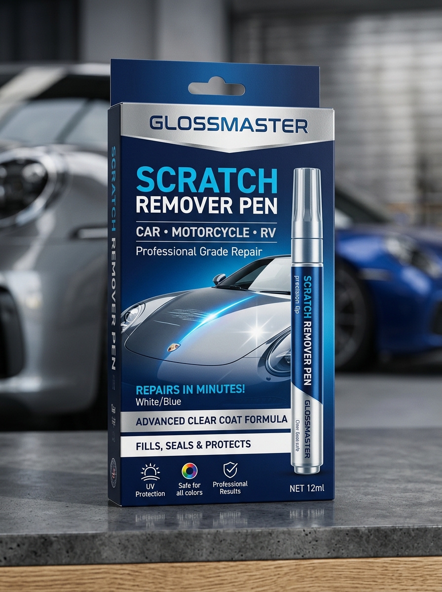
Packaging for a scratch remover pen utilizes color psychology to influence consumer trust and perceived effectiveness. Blue is frequently employed to signal reliability and professional-grade results, instilling confidence in the product's chemical formula. Conversely, red accents often highlight urgency or the "instant" nature of the repair, appealing to car owners seeking rapid solutions.
Furthermore, black and metallic silver palettes denote a premium, high-performance tool, aligning the pen with luxury automotive care. In contrast, bright yellow is often used to emphasize safety and high visibility on retail shelves. By strategically selecting these hues, manufacturers communicate technical authority, ensuring the product appears as a precise instrument for paint restoration rather than a temporary cosmetic fix. This visual strategy directly optimizes conversion rates within the competitive automotive detailing market.
Strategic Typography for Clarity and Technical Trust
For technical automotive solutions like the Scratch Remover Pen, typography is a critical tool for establishing professional credibility. By utilizing a high-contrast visual hierarchy and clean, sans-serif typefaces, we ensure that complex application instructions and chemical safety data are instantly legible for the end user.
Strategic font selection reinforces technical trust by conveying precision and modern engineering. Clear headings and optimized line spacing allow DIY enthusiasts to navigate technical specifications without confusion, reducing the risk of application errors. This focus on typographic clarity signals product quality, reassuring customers that they are using a reliable, professional-grade tool for vehicle paint restoration. Well-structured text doesn't just inform; it builds the consumer confidence necessary for high-performance surface repair.
The Role of Iconography in Communicating Rapid Results
In the automotive care industry, iconography serves as a vital visual shorthand to convey the efficiency of a scratch remover pen. High-quality symbols-such as lightning bolts, stopwatches, or simplified "before-and-after" graphics-instantly signal the product's fast-acting capabilities to consumers. These visual cues bypass language barriers, providing immediate reassurance that paint blemishes can be rectified in seconds.
Strategic icons reduce cognitive load, allowing DIY enthusiasts to identify instant repair solutions at a glance. By highlighting "one-step" application processes through intuitive graphics, brands reinforce the promise of professional-grade results without extensive labor. Ultimately, effective iconography acts as a psychological trigger, validating the rapid restoration benefits of the pen and streamlining the user's path to purchase by emphasizing time-saving performance.
Balancing Industrial Utility with Premium Aesthetic Appeal
The modern scratch remover pen serves as a bridge between high-performance automotive engineering and luxury design. Its industrial utility is defined by advanced, UV-curable resins that provide a permanent, weather-resistant seal for paint imperfections. This technical prowess ensures professional-grade results that protect the vehicle's structural integrity against oxidation and rust.
Complementing this rugged functionality is a premium aesthetic appeal. Manufacturers now prioritize sleek, ergonomic form factors that mirror the sophistication of high-end vehicle interiors. By housing industrial strength within a refined applicator, these pens offer a seamless user experience. This balance ensures that a vital maintenance tool feels less like a harsh chemical product and more like an essential, elegant accessory for the discerning car enthusiast who demands both efficiency and style.
Material Selection and Structural Integrity of Pen Cases
The durability and effectiveness of a scratch remover pen depend heavily on its material composition. Most high-quality pen barrels are engineered from high-density polyethylene (HDPE) or reinforced aluminum. These materials are chosen for their exceptional chemical resistance, ensuring the potent resins and solvents inside do not compromise the container's structural integrity.
To maintain the formula's shelf life, the casing must provide an airtight seal to prevent evaporation and oxidation. Furthermore, opaque materials are utilized for UV protection, shielding the light-sensitive clear coat from premature curing. A robust, precision-molded design prevents leaking under pressure during application and ensures the pen remains functional even when stored in high-temperature environments, such as a vehicle's glove box. This focus on material science guarantees a reliable tool for seamless automotive paint restoration.
Leveraging Transparency and Window Cutouts for Product Visibility
Strategic packaging for a scratch remover pen utilizes window cutouts and transparent materials to bridge the gap between consumer expectations and product reality. By allowing potential buyers to view the actual applicator tip and fluid reservoir, manufacturers enhance shelf appeal and establish immediate brand trust. This visual accessibility is critical for automotive detailing tools, as it confirms the pen's mechanical design-whether a precision felt-tip or a specialized brush-without compromising the factory seal.
Furthermore, transparency acts as a functional indicator of liquid consistency and color accuracy. For clear coat formulas, seeing the transparent solution reinforces the promise of a seamless, invisible finish. Incorporating these design elements into the retail display minimizes purchase hesitation and improves the user experience by ensuring the correct tool is selected for vehicle surface restoration.
Creating a Cohesive Brand Identity Across Product Lines
Establishing a powerful brand identity for a scratch remover pen requires visual and functional consistency across all automotive care offerings. A unified aesthetic-utilizing synchronized color palettes, professional typography, and recognizable logos-ensures that customers instantly identify your surface restoration solutions on crowded retail shelves.
Whether marketing a clear-coat applicator, a deep-paint repair kit, or specialized buffing compounds, maintaining a singular brand voice reinforces authority and consumer trust. By aligning packaging design with high-performance expectations, manufacturers foster long-term loyalty. Integrating this cohesive identity allows a scratch repair brand to scale effectively, positioning every new innovation as a premium, reliable tool for professional-grade vehicle maintenance. This strategic approach highlights a commitment to quality, making the brand the primary choice for enthusiasts seeking seamless, high-gloss paint correction results.
The Impact of Ergonomic Packaging on User Experience
The physical design of a scratch remover pen plays a critical role in the success of automotive paint repairs. Ergonomic packaging is engineered to provide a secure grip and superior control, allowing users to apply the restorative formula with surgical precision. By incorporating a contoured barrel and a flow-regulated applicator tip, these pens minimize hand fatigue and prevent accidental over-application on delicate surfaces.
Enhanced maneuverability ensures that even DIY novices can achieve professional-grade results. Furthermore, user-friendly features like airtight caps and portable dimensions improve the overall user experience (UX), making vehicle maintenance faster and more efficient. Ultimately, high-quality ergonomic housing protects the chemical integrity of the liquid filler while simplifying the restoration process for car owners.
Future-Proofing Designs with Sustainable Packaging Solutions
As consumer demand shifts toward environmental responsibility, the automotive care industry is evolving. Implementing sustainable packaging for the scratch remover pen is a vital step in future-proofing product designs. By utilizing recyclable polymers or biodegradable materials, manufacturers can significantly reduce the ecological footprint of automotive maintenance tools without compromising product efficacy.
Strategic packaging solutions focus on minimalism and durability, ensuring the chemical formula remains stable while minimizing plastic waste. Transitioning to soy-based inks and FSC-certified paperboard for retail displays further aligns brands with circular economy principles. This commitment to green innovation not only meets tightening global regulations but also builds long-term brand loyalty among eco-conscious vehicle owners. Sustainable design ensures that essential car repair products remain both competitive and compliant in an increasingly green marketplace.
Leave a comment