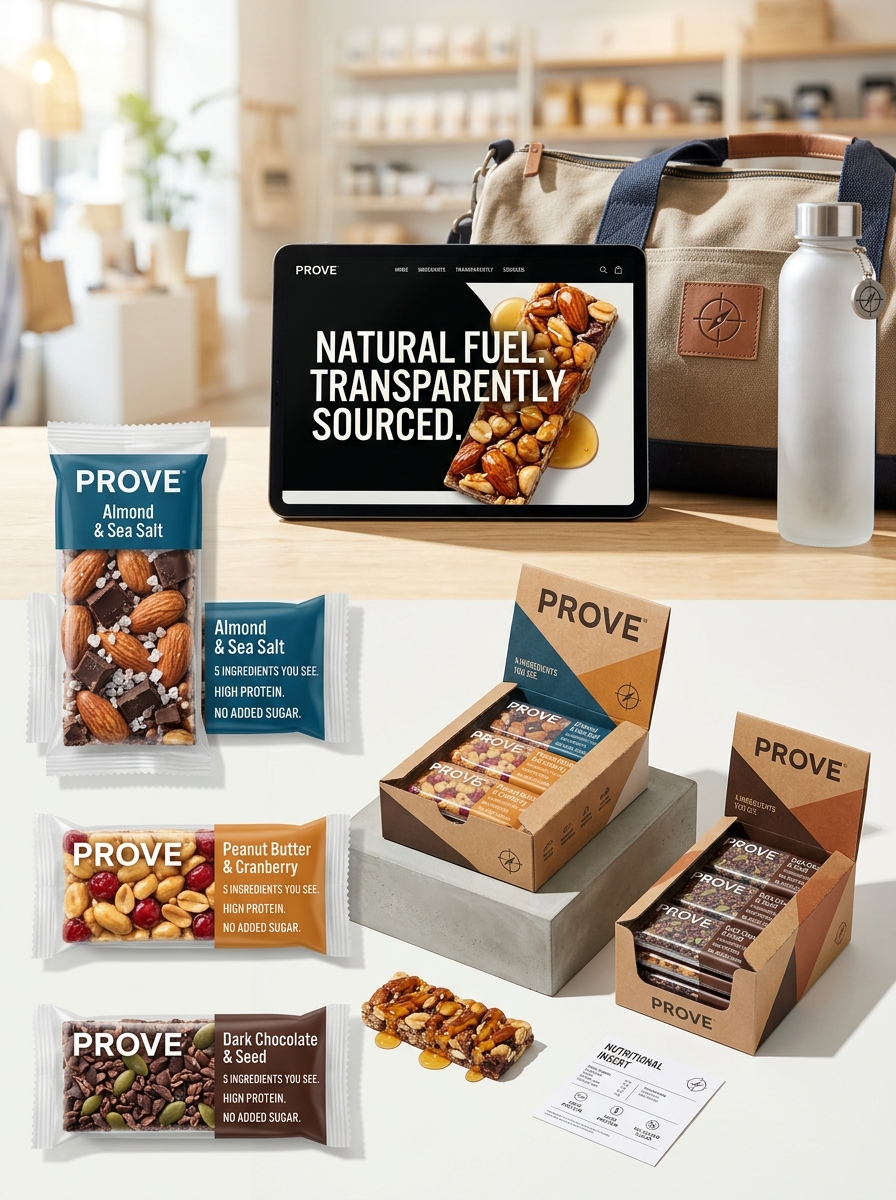
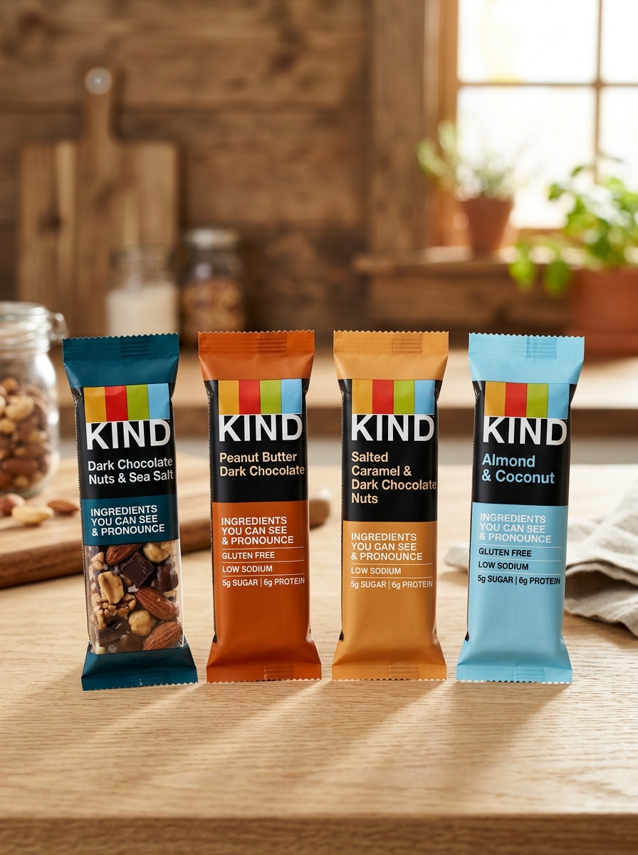
Kind Bar has fundamentally reshaped the snack food landscape through a packaging strategy that prioritizes radical transparency. By moving away from traditional opaque wrappers, the brand utilizes clear windows to showcase whole nuts, fruits, and grains, instantly communicating quality and authenticity. This approach forms the cornerstone of their visual identity, bridging the gap between product promise and consumer reality.
Beyond the transparent film, Kind Bar employs minimalist typography and a sophisticated color-coding system to facilitate effortless shelf navigation. Every design element-from the matte finish to the structured grid layout-is meticulously crafted to reinforce brand aesthetics centered on health and simplicity. Understanding these essential principles offers a blueprint for how functional packaging can drive consumer trust and establish a dominant market presence in the health food sector.
The Core Philosophy of Radical Transparency in Design
Kind Bars revolutionized the snack industry by pioneering radical transparency through their iconic packaging. At the heart of their design philosophy is the belief that consumers deserve to see exactly what they are eating. By utilizing a clear, windowed wrapper, Kind showcases real, recognizable ingredients like whole nuts, seeds, and dried fruits.
This visual honesty departs from traditional snack marketing, which often relies on opaque packaging to hide processed textures. For Kind, transparency is a strategic commitment to brand integrity and consumer trust. By making the physical product the centerpiece of the design, the packaging serves as a direct testament to the "KIND Promise" of using nutrient-dense ingredients, effectively bridging the gap between health claims and visible reality.
The Iconic Clear Window and the Power of Visual Proof
Kind Bars revolutionized the snack industry by prioritizing transparency through their signature clear packaging. Unlike competitors that hide processed ingredients behind opaque wrappers, Kind utilizes a transparent window to provide visual proof of their nutritional integrity.
This design choice allows consumers to see whole nuts, seeds, and vibrant fruits, reinforcing the brand's commitment to "ingredients you can see and pronounce." By showcasing the actual product, Kind builds immediate consumer trust and leverages the psychological impact of authenticity. This visual transparency serves as a silent marketing tool, proving that the product is minimally processed. In a crowded marketplace, the clear window remains a powerful differentiator, transforming simple ingredients into a compelling aesthetic and nutritional promise that resonates with health-conscious shoppers.
Strategic Information Hierarchy and Ingredient Prioritization
Kind Bars utilize a strategic information hierarchy designed to foster immediate consumer trust through radical transparency. This approach centers on ingredient prioritization, where whole nuts, fruits, and grains serve as the primary focal point. By employing transparent packaging, Kind establishes a visual hierarchy that authenticates product quality before the consumer even reads the nutritional panel.
The brand's communication strategy follows a "clean label" philosophy, ensuring high-priority data is accessible at a glance. Key elements include:
- Visual Evidence: Showcasing recognizable, whole food components.
- Nutritional Callouts: Prioritizing low glycemic index, gluten-free, and no artificial sweetener claims.
- Verbal Simplicity: Emphasizing ingredients "you can see and pronounce."
This semantic layering ensures that health-conscious shoppers identify functional benefits quickly, effectively distinguishing Kind Bars from highly processed competitors.
Typography and the Bold Simplicity of Kind Branding
Kind Bars leverage a minimalist design language rooted in typographic clarity and transparency. The brand utilizes a bold, sans-serif typeface-specifically a customized version of Trade Gothic-to project an image of honesty and strength. This "bold simplicity" ensures high shelf visibility while aligning with the brand's core philosophy: "ingredients you can see and pronounce."
The typographic hierarchy often features all-caps descriptors for primary ingredients, contrasted by a friendly, lowercase logo. This balance creates an approachable yet authoritative visual identity. By pairing clean, black lettering with transparent packaging, Kind uses typography to emphasize its "nothing to hide" mission. This strategic use of white space and heavy weights distinguishes the product in a cluttered market, signaling premium quality through straightforward, unadorned communication.
Color Psychology and Flavor Differentiation on the Shelf
Kind Bars utilize a sophisticated blend of transparent packaging and strategic color psychology to dominate the snack aisle. By showcasing whole nuts and fruits through clear windows, the brand establishes immediate trust and appetite appeal. To facilitate rapid flavor differentiation, Kind employs vibrant, color-coded accents that serve as visual shorthand for consumers.
For example, deep blues often denote sea salt varieties, while earthy greens signify protein-rich options and warm oranges represent honey or maple profiles. This visual hierarchy reduces cognitive load, allowing shoppers to navigate the extensive product line intuitively. These intentional color cues evoke specific taste expectations and reinforce the brand's identity of "healthy indulgence," ensuring each variety remains distinct yet cohesive on a crowded retail shelf.
Balancing Minimalist Aesthetics with Nutrient Dense Messaging
Kind Bars revolutionized the snack industry by harmonizing minimalist aesthetics with nutrient-dense messaging. Their iconic transparent packaging is a strategic design choice that allows the product's whole ingredients-such as whole nuts and real fruit-to serve as the primary visual hook.
By utilizing a "clean label" approach, Kind reduces cognitive clutter, focusing on the core promise of "ingredients you can see and pronounce." This visual transparency bridges the gap between sophisticated, understated branding and rigorous nutritional integrity.
The result is a powerful consumer trust-builder. The minimalist layout ensures the packaging never overshadows the food's quality, proving that functional design and health-conscious communication can coexist to drive brand loyalty in a crowded marketplace.
Materiality and the Tactile Experience of Kind Packaging
The materiality of Kind Bar packaging is a strategic cornerstone of its sensory branding. By utilizing clear, high-quality plastic film, Kind emphasizes transparency, allowing the tactile texture of whole nuts and fruits to be visually perceived before the package is even opened. This choice of material creates a "what you see is what you get" promise, fostering immediate consumer trust.
The wrapper's physical feel-a balance between a sturdy, premium grip and the irregular, bumpy contours of the ingredients underneath-reinforces the perception of minimally processed food. Unlike traditional opaque foils, Kind's packaging provides a substantial hand-feel that communicates quality. This tactile interaction serves as a vital touchpoint, aligning the physical product experience with the brand's core values of honesty and wholesome nutrition.
Maintaining Visual Consistency Across Product Extensions
KIND has successfully scaled its brand from original fruit-and-nut bars to granola, breakfast bars, and frozen treats by prioritizing visual uniformity. A core element of their strategy is the signature transparent packaging window, which reinforces the brand's commitment to "ingredients you can see and pronounce."
To ensure seamless brand recognition across diverse product categories, KIND utilizes a standardized design hierarchy. Key elements include:
- The iconic, bold black KIND logo positioned prominently.
- Clean, sans-serif typography for easy readability.
- Strategic color-coding that identifies specific flavor profiles across different formats.
By maintaining these signature aesthetic markers, KIND creates a cohesive brand ecosystem. This visual continuity builds consumer trust and ensures that new product extensions are immediately recognizable, effectively leveraging existing brand equity to drive sales across the entire aisle.
The Impact of Clean Design on Consumer Trust and Brand Loyalty
Kind Bars revolutionized the healthy snack market by utilizing transparent packaging as a core design element. This "what you see is what you get" approach acts as a visual shorthand for honesty, allowing consumers to verify the quality of whole nuts and fruits instantly. By removing the mystery often found in processed snack wrapping, Kind builds immediate consumer trust.
The minimalist aesthetic and clear typography further reinforce the brand's "ingredients you can see and pronounce" philosophy. This design-led transparency reduces cognitive load for shoppers, making the healthy choice the easy choice. Over time, this consistent visual integrity fosters deep brand loyalty, as customers associate the clean design with nutritional reliability. In a crowded aisle, Kind's commitment to visual clarity transforms a simple snack into a trusted lifestyle staple.
Future Directions in Sustainable and Purpose Driven Packaging Design
Kind Bars is actively evolving its packaging strategy to align with global environmental goals. The brand is pivoting toward a circular economy by prioritizing recyclable materials and reducing its reliance on virgin plastics. A key focus for future innovation includes the integration of Post-Consumer Recycled (PCR) content into snack wrappers, significantly lowering the carbon footprint of each bar.
Beyond material science, purpose-driven design focuses on consumer transparency. Future packaging will likely feature enhanced labeling to guide proper disposal and highlight sustainable sourcing practices. By exploring bio-based alternatives and simplified film structures, Kind aims to eliminate waste without compromising product freshness. These advancements represent a commitment to eco-friendly snacking, ensuring that Kind's mission of health extends from the nutrient-dense ingredients to the very materials that protect them.
Leave a comment