The kitchen gadget market relies heavily on visual storytelling and structural integrity. Effective vegetable chopper packaging design transcends mere protection; it serves as a silent salesperson that communicates efficiency and culinary ease. By integrating cohesive brand aesthetics-ranging from minimalist color palettes to high-resolution product imagery-manufacturers can instantly establish trust with home cooks.
Key elements such as ergonomic unboxing experiences, sustainable materials, and clear instructional typography are vital for modern kitchen brands. Understanding the intersection of functionality and visual identity allows products to stand out on crowded retail shelves. This guide examines how strategic design choices transform simple containers into powerful branding tools that resonate with health-conscious consumers and culinary enthusiasts alike, ensuring the product's value is felt long before the first dice or slice.
The Strategic Role of Packaging in Kitchenware Branding
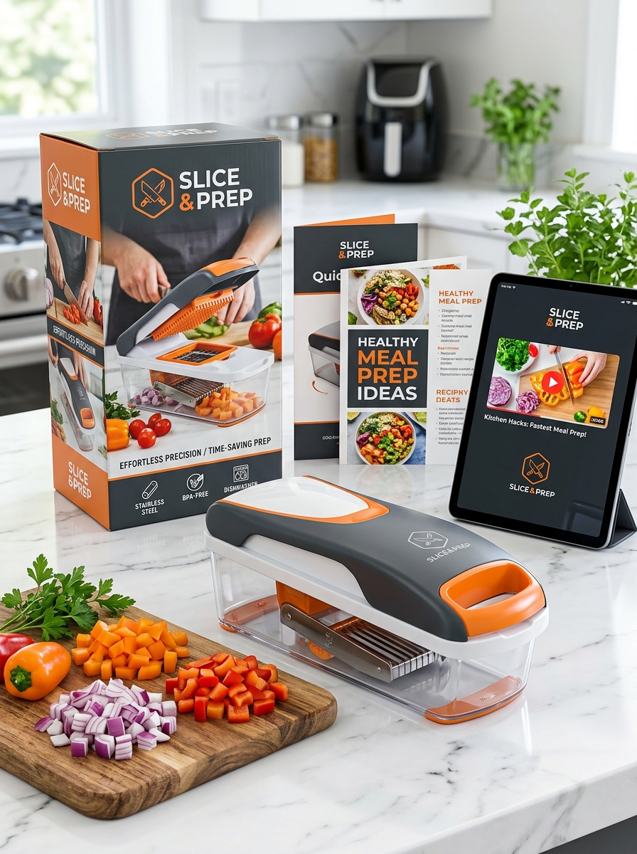
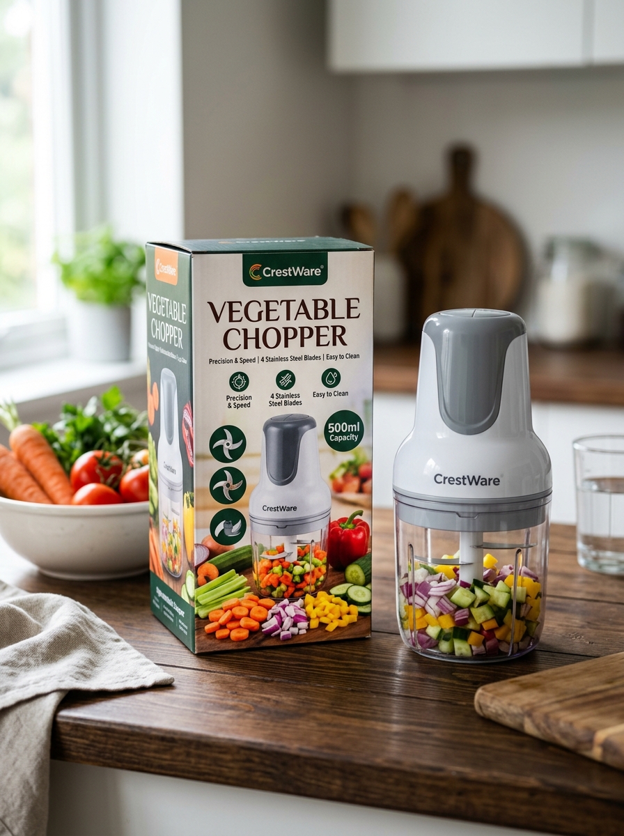
In the competitive kitchenware market, the packaging of a vegetable chopper serves as a vital brand ambassador. Beyond mere protection, strategic packaging communicates the tool's precision, safety features, and durability. High-quality visual design-featuring vibrant imagery of fresh produce and clear typography-instantly highlights unique selling points like stainless steel blades and BPA-free materials.
For modern brands, the unboxing experience is a key touchpoint for building customer loyalty. Utilizing eco-friendly materials and robust structures not only prevents transit damage but also aligns the product with sustainable consumer values. By integrating cohesive branding elements, manufacturers elevate a functional kitchen gadget into a premium lifestyle essential. This strategic approach increases perceived value, ensuring the product stands out on crowded retail shelves and digital marketplaces alike.
Visual Identity and Color Psychology for Culinary Tools
The visual identity of a vegetable chopper significantly influences consumer perception and kitchen aesthetics. Color psychology is a strategic tool used by manufacturers to evoke specific emotional responses. For instance, vibrant green is frequently used to symbolize freshness, health, and organic produce, aligning perfectly with the tool's purpose of processing vegetables.
In contrast, bold red accents can stimulate appetite and energy, while sleek stainless steel or monochromatic tones like black and white convey professional-grade precision and hygiene. These design choices do more than look good; they build brand trust and indicate the tool's durability. By integrating these visual elements, culinary brands ensure that their kitchen gadgets feel like essential, high-quality instruments that enhance the modern cooking experience and promote healthy lifestyle choices.
Balancing Material Durability with Sustainable Design
When selecting a vegetable chopper, the intersection of longevity and environmental impact is crucial. Modern kitchen gadgets must withstand rigorous daily use while adhering to eco-conscious standards. Manufacturers are increasingly balancing these needs by utilizing high-grade 304 stainless steel blades paired with reinforced, BPA-free plastics or borosilicate glass.
A durable design is inherently sustainable; a tool that lasts for years prevents the "throwaway culture" and reduces landfill waste. Furthermore, many premium choppers now feature modular components that are easily replaceable or recyclable. By choosing manual, non-electric vegetable slicers made from high-density, non-toxic materials, consumers can achieve professional prep results while minimizing their carbon footprint. This synergy ensures your kitchen tools are both heavy-duty and environmentally responsible.
Maximizing Impact with High-Resolution Product Photography
In the digital marketplace, high-resolution product photography is essential for showcasing the precision and build quality of a vegetable chopper. Since customers cannot physically handle the device, crisp visuals must communicate its value. Clear images highlight critical features such as the razor-sharp stainless steel blades, reinforced BPA-free plastic components, and non-slip bases.
To drive conversions, utilize diverse perspectives:
- Macro Close-ups: Emphasize blade thickness and cutting edge durability.
- Action Shots: Demonstrate the chopper's efficiency with uniform dices of vibrant vegetables.
- Exploded Views: Show how easily the unit disassembles for cleaning.
Professional imagery builds consumer trust and reduces return rates by providing an accurate representation of the tool. Optimized images paired with descriptive alt-text also improve SEO, ensuring your kitchen gadget stands out in search results.
Typography and Information Hierarchy for Consumer Clarity
Effective typography and information hierarchy are critical for ensuring the safe and efficient use of a vegetable chopper. By utilizing high-contrast fonts and logical layouts, manufacturers guide consumers through essential safety warnings, assembly instructions, and blade identification.
A clear hierarchy prioritizes key information, such as:
- Safety Alerts: Bold, sans-serif typefaces highlight sharp blade warnings.
- Functional Guidance: Distinct headers differentiate between dicing, slicing, and spiralizing functions.
- Maintenance Details: Bulleted lists clarify dishwasher compatibility and storage tips.
Optimizing text legibility reduces user error and enhances the overall consumer experience. When technical specifications and capacity limits are easy to scan, users can operate the kitchen tool with greater confidence and precision.
Communicating Versatility Through Graphic Iconography
To effectively showcase the multi-functional nature of a premium vegetable chopper, graphic iconography serves as a crucial visual language. These symbols bridge the gap between technical blade features and user intuition, instantly communicating the tool's versatility across diverse culinary tasks.
By utilizing clear, intuitive icons, manufacturers highlight specific functions such as dicing, julienning, slicing, and grating. This semantic visual approach allows users to quickly identify which attachments are suitable for different ingredients, from firm root vegetables to delicate herbs.
Strategic use of iconography simplifies the user experience, reducing the learning curve and emphasizing the appliance's efficiency. Ultimately, these graphic cues reinforce the product's value as an all-in-one kitchen solution, making complex food preparation accessible through streamlined, non-verbal communication.
Integrating Safety Standards and Regulatory Compliance Labels
Ensuring consumer protection and product longevity in vegetable choppers requires strict adherence to global safety standards. High-quality manual and electric slicers must feature regulatory compliance labels such as BPA-free certifications and FDA or LFGB food-grade material approvals. These markers guarantee that the plastic and stainless steel components will not leach harmful chemicals into ingredients during food preparation.
Compliance also extends to mechanical integrity. Manufacturers prioritize the following safety features:
- UL/ETL Listing: Verification for electrical safety in motorized models.
- Locking Mechanisms: Compliance with injury-prevention protocols.
- Non-slip Stability: Standards for ergonomic base grip to prevent sliding.
By integrating these verified standards, brands ensure their vegetable choppers meet rigorous testing for sharpness, durability, and user safety, providing a reliable and hazard-free culinary experience.
Designing an Intuitive and Memorable Unboxing Experience
For a modern vegetable chopper, the unboxing experience is the first touchpoint of user satisfaction. A premium presentation begins with organized, eco-friendly packaging that ensures all sharp stainless steel blades and attachments are securely nested and clearly visible. Prioritizing safety through clearly labeled blade cartridges prevents accidental cuts during the initial setup.
To optimize the user journey, include a high-contrast quick-start guide placed directly on top of the components. This reduces friction by illustrating how to swap dicing grids and lock the lid effortlessly. By combining sustainable materials with an intuitive layout, brands can transform a functional kitchen tool into a professional culinary gift. A seamless out-of-the-box experience builds immediate consumer trust, encourages positive reviews, and minimizes product returns caused by assembly confusion.
Eco-Conscious Packaging Trends in Modern Appliance Design
As sustainability becomes a priority for kitchenware manufacturers, the vegetable chopper market is shifting toward eco-conscious packaging. Modern appliance design now emphasizes minimizing environmental impact by replacing traditional plastic buffers and styrofoam with biodegradable molded pulp or recycled cardboard inserts.
Brands are increasingly utilizing FSC-certified paper and soy-based inks to ensure the unboxing experience is fully compostable. These trends focus on reducing "dead space" within boxes, which optimizes shipping density and lowers the overall carbon footprint. By eliminating single-use plastics and prioritizing renewable materials, manufacturers align their functional kitchen tools with the values of green consumers. This holistic approach ensures that the convenience of a high-efficiency vegetable chopper is matched by responsible, planet-friendly packaging solutions.
Ensuring Aesthetic Consistency Across Diverse Product Lines
Maintaining a unified brand identity is essential when designing a vegetable chopper alongside other kitchenware. Aesthetic consistency ensures that whether a customer purchases a manual dicer or an electric food processor, the products feel like part of a cohesive collection.
To achieve this, manufacturers focus on several key design elements:
- Visual Language: Using signature color palettes and finishes, such as matte plastics or brushed stainless steel.
- Ergonomic Silhouettes: Implementing similar handle shapes and button placements across different models.
- Material Integration: Utilizing consistent blade quality and container transparency levels.
By prioritizing these uniform design standards, brands build consumer trust and recognition. A well-aligned product line suggests professional quality and seamless integration within a modern kitchen environment, making the vegetable chopper an instantly recognizable tool in the culinary toolkit.
Leave a comment