Mastering pure maple syrup packaging design requires a sophisticated balance between artisanal heritage and contemporary shelf appeal. As consumers increasingly prioritize transparency and authenticity, the visual identity of a brand must communicate the liquid gold's premium quality at a single glance.
Effective branding concepts focus on leveraging the natural clarity of the product, utilizing minimalist typography and sustainable materials to evoke a sense of organic luxury. From the choice of iconic glass carafes to modern, eco-friendly pouches, every element of the packaging strategy serves to establish trust and convey a story of craftsmanship. By integrating essential aesthetics with functional design, producers can differentiate their offerings, ensuring their maple syrup resonates with health-conscious buyers seeking genuine, high-quality forest products.
The Evolution of Maple Syrup Branding
Historically, pure maple syrup branding was utilitarian, focusing on bulk storage in simple tins or glass jugs. As the market matured, branding shifted from a commodity-based approach to one centered on premium storytelling and terroir.
A significant turning point occurred with the 2015 international grading harmonization. Branding moved away from confusing "Grade A" and "Grade B" distinctions toward descriptive flavor profiles like "Dark, Robust Taste." Modern producers now utilize minimalist design and sustainable packaging to highlight single-origin authenticity and artisanal techniques, such as wood-fired evaporation. This evolution reflects a growing consumer desire for transparency, heritage, and high-quality, natural sweeteners. By emphasizing craft over quantity, maple syrup branding has successfully repositioned this forest product as a sophisticated, gourmet staple.
Defining Your Target Maple Syrup Consumer
To effectively market pure maple syrup, you must identify segments that value quality over cost. The primary audience consists of health-conscious consumers seeking natural, unrefined alternatives to processed sugars. These individuals prioritize the antioxidants and minerals found in authentic 100% maple products.
Key demographics include:
- Gourmet Home Cooks: Culinary enthusiasts who use Grade A Amber or Dark Robust syrups for complex flavor profiles in both sweet and savory dishes.
- Eco-Conscious Shoppers: Buyers who support sustainable forestry and traditional harvesting practices.
- Artisanal Gift Buyers: Consumers looking for premium, heritage-rich products for special occasions.
By targeting those who reject high-fructose corn syrup in favor of organic, forest-to-table ingredients, you reach a loyal base that appreciates the transparency and craftsmanship of genuine sugarmaking.
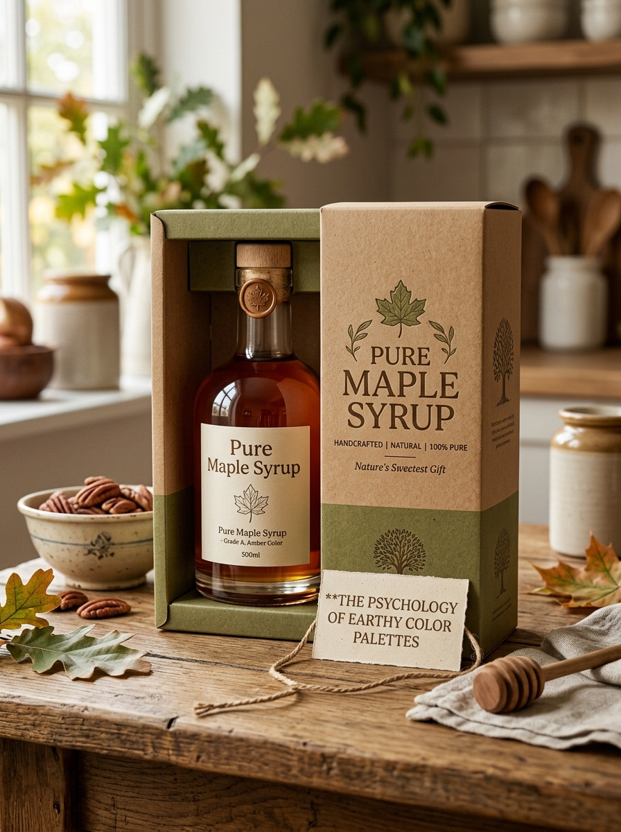
The Psychology of Earthy Color Palettes
The visual identity of pure maple syrup relies heavily on earthy color palettes, utilizing rich ambers, deep sienna, and warm golds. Psychologically, these tones evoke a sense of reliability, comfort, and organic authenticity. By mirroring the natural environment, these colors establish a subconscious connection between the consumer and the forest.
- Nature Connection: Earthy hues mimic tree bark and autumn leaves, reinforcing the product's raw, botanical origins.
- Trust and Purity: Deep browns and ambers signal a lack of artificial dyes, suggesting a wholesome, traditional harvesting process.
- Emotional Warmth: These palettes stimulate feelings of nostalgia and hearth-side comfort, making the product feel more accessible and premium.
Leveraging these pigments communicates a brand's commitment to heritage, aligning consumer expectations with the unadulterated quality of the syrup.
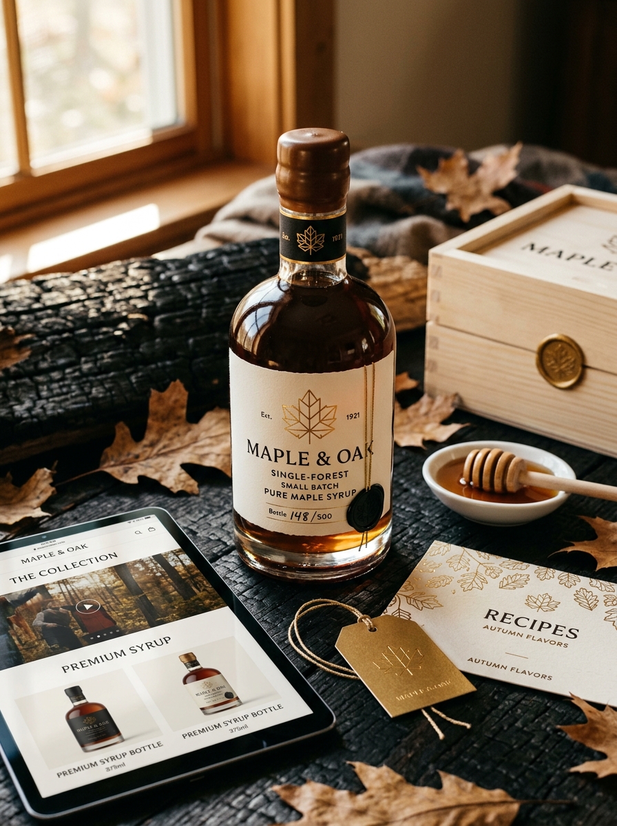
Typography That Tells a Heritage Story
The visual identity of pure maple syrup relies heavily on typography to communicate its rich, artisanal history. Branding often utilizes vintage-inspired serif fonts and hand-drawn scripts that evoke the rustic charm of 19th-century sugar shacks. These typographic choices serve as a visual shorthand for authenticity, suggesting a product that is harvested with traditional methods rather than mass-produced.
By incorporating weathered textures and bold, wood-block lettering, designers bridge the gap between modern packaging and the rugged landscape of the maple grove. This intentional use of type honors the legacy of the "sugarbush," transforming a simple label into a narrative of craftsmanship. Ultimately, heritage-driven typography ensures that the story of generational passion and natural purity is felt by the consumer before the bottle is even opened.
Material Choices: Glass Versus Traditional Tin
When selecting pure maple syrup, the packaging material significantly impacts both preservation and presentation. Glass bottles are the premium choice for showcasing the syrup's clarity and amber hue. Being non-porous and chemically inert, glass ensures the flavor remains untainted while offering an airtight seal for long-term refrigeration.
Conversely, traditional tin containers offer a nostalgic aesthetic and superior protection against light. Light exposure can degrade syrup quality over time; metal cans block 100% of UV rays, making them ideal for bulk storage. While tin is lightweight and durable for transport, glass is preferred for table service and gifting. Ultimately, glass preserves the delicate nuances of the maple harvest, whereas tin provides a durable, light-proof environment for high-volume use.
Visual Motifs Inspired by the Sugar Bush
The sugar bush serves as a profound source of inspiration for the aesthetic identity of pure maple syrup. At the heart of these visual motifs is the iconic five-lobed maple leaf, symbolizing the botanical origin and seasonal cycle of the harvest. Designers often draw upon the rustic textures of weathered bark and the rhythmic geometry of galvanized sap buckets hanging from traditional spiles to evoke a sense of heritage.
Color palettes are driven by the syrup's natural amber hues, contrasted against the cool grays of late-winter woods and the ethereal white steam rising from the sugar shack. These organic elements, alongside wood grain patterns and fluid sap droplets, reinforce the artisanal quality of the product. By utilizing these natural motifs, brands communicate the authenticity, purity, and deep-rooted environmental connection inherent in high-quality maple production.
Sustainable Packaging Solutions for Modern Brands
For modern pure maple syrup producers, sustainable packaging is essential to align with the product's natural origins. Consumers seeking premium, organic sweeteners increasingly favor brands that demonstrate environmental responsibility. Transitioning to recyclable glass bottles or BPA-free, high-density polyethylene (HDPE) jugs helps preserve the syrup's complex flavor profile while supporting a circular economy.
Innovative brands are also adopting lightweight, flexible pouches and biodegradable labels to significantly reduce shipping weight and the overall carbon footprint. By integrating these eco-friendly packaging solutions, maple syrup companies can protect the forest's bounty while appealing to eco-conscious shoppers. Prioritizing renewable materials ensures that your brand remains competitive and reflects the purity of the sap from which the syrup is harvested.
The Art of Authentic Brand Storytelling
In the competitive market for pure maple syrup, authentic brand storytelling is the bridge between the sugar bush and the consumer. To resonate with modern audiences, brands must move beyond basic labeling to highlight their heritage, sustainable tapping practices, and the artisanal evaporation process.
Effective storytelling focuses on transparency, showcasing the journey from clear maple sap to nutrient-dense liquid gold. By utilizing semantic keywords such as "tree-to-table," "single-origin," and "small-batch craftsmanship," producers build trust and authority.
Sharing the family legacy or the specific ecology of the forest helps differentiate high-quality Grade A maple syrup from mass-produced corn syrup alternatives. Ultimately, authentic narratives transform a simple sweetener into a premium experience, connecting health-conscious consumers with the natural history and seasonal rhythms of the northern woods.
Functional Design for Enhanced User Experience
The packaging of pure maple syrup has evolved to prioritize functional design, significantly improving the consumer journey. Modern ergonomic bottles and anti-drip caps ensure a mess-free experience, preventing the sticky buildup common with traditional containers. These structural innovations allow for precise pouring, whether drizzling over breakfast or measuring for gourmet recipes.
Furthermore, clear labeling and transparent glass containers enhance transparency, allowing users to easily identify syrup grades and clarity. Many brands now utilize slim-profile packaging optimized for refrigerator storage, preserving the product's delicate flavor profile and nutritional integrity. By integrating sustainable materials and user-centric features, producers ensure that the utility of the vessel matches the premium quality of the natural sweetener, creating a seamless and enjoyable culinary experience from pantry to plate.
Balancing Aesthetic Appeal with Regulatory Compliance
Producing premium pure maple syrup requires a delicate harmony between visual marketing and strict legal standards. While the shimmering golden hue and elegant glass bottling drive consumer interest, producers must adhere to precise grading systems established by regulatory bodies like the USDA or CFIA.
Labels must feature high-quality aesthetics while meeting mandatory requirements, including Grade A classifications based on light transmission and flavor intensity. Key compliance factors include accurate Brix levels (sugar content), net weight declarations, and allergen statements. By integrating sophisticated packaging with transparent data regarding geographic origin and purity, brands build consumer trust. Ultimately, successful maple syrup producers leverage high-definition clarity and rich amber tones to signify quality, ensuring the product is as legally compliant as it is visually enticing on the shelf.
Leave a comment