

Elevating Moleskine pocket notebook packaging design involves a meticulous blend of minimalist principles and high-end visual aesthetics. These legendary journals command a unique position in the stationery market, where the tactile experience of the packaging is just as vital as the internal paper quality.
To master the art of Moleskine presentation, designers must focus on the iconic paper band, subtle typography, and the overall sensory appeal of the materials used. By prioritizing premium branding and clean graphic layouts, you can transform a simple protective layer into a powerful statement of artistic heritage. This exploration delves into the essential elements of color theory, texture, and structural design that define the global standard for sophisticated notebook packaging and consumer appeal.
The Evolution of Moleskine Packaging Heritage
The packaging of Moleskine pocket notebooks represents a seamless blend of historical storytelling and functional design. Rooted in the tradition of the anonymous black journals favored by 19th-century avant-garde artists and thinkers, the brand has meticulously preserved its heritage while evolving for the modern creator.
A central element of this evolution is the iconic paper band, often referred to as the "B-side." Originally a simple product wrap, it has transformed into a creative asset, featuring reusable templates, brand history, or artistic collaborations. This evolution reflects a commitment to sustainable utility and tactile elegance. From the signature elastic closure to the expandable inner pocket, every aspect of the packaging reinforces the Moleskine legacy, ensuring these portable journals remain a timeless symbol of culture, travel, and personal identity.
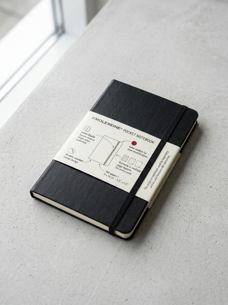
Anatomy of the Iconic Paper Band Design
The Moleskine Pocket Notebook is instantly recognizable by its signature paper band, often referred to as the "B-side." This functional sleeve serves as more than just packaging; it is a meticulously engineered component of the brand's heritage.
Crafted from durable cardstock, the exterior displays essential product specifications and minimalist typography. On the reverse side, Moleskine maximizes utility by printing creative templates-such as calendars, rulers, or artistic patterns-encouraging users to repurpose the band.
This design element secures the notebook during retail while protecting the expandable inner pocket and oilcloth cover. By blending sustainability with aesthetic utility, the paper band reinforces the notebook's legendary status, providing a tactile introduction to the creative experience held within its pages.
Minimalist Visual Language and Brand Identity
Moleskine pocket notebooks are defined by a minimalist visual language that prioritizes functional elegance. Their iconic design-featuring rounded corners, a durable black cover, and the signature elastic closure-creates an instantly recognizable brand identity. This understated aesthetic serves as a "blank canvas," appealing to creative professionals and thinkers who value simplicity and portability.
By maintaining a consistent, quiet design across decades, Moleskine reinforces a legacy of intellectual prestige and creative heritage. The tactile experience of the ivory-colored paper and the ribbon bookmark further enhances this premium identity. Ultimately, the minimalist approach ensures the notebook remains a timeless accessory, bridging the gap between historical artistic tradition and modern professional utility without the need for overt branding or distracting ornamentation.
Tactile Aesthetics and Premium Material Selection
Moleskine pocket notebooks are defined by their distinct tactile aesthetics, offering a sensory experience that elevates standard note-taking. The premium material selection starts with the signature ivory-colored, acid-free paper, meticulously engineered for a smooth writing surface that preserves ink integrity and prevents yellowing over time.
Each notebook is encased in a durable cover featuring iconic rounded corners, available in both classic hard and flexible soft variants. This sophisticated hand-feel is complemented by functional elements like the elastic closure and an expandable inner pocket. By prioritizing haptic quality and archival-grade components, Moleskine ensures every pocket journal serves as a reliable, professional tool for creators who value the physical connection between thought and paper.
Typography and Graphic Placement Strategies
Moleskine Pocket Notebooks utilize a minimalist design philosophy where typography and graphic placement are central to brand identity. The iconic Copperplate Gothic typeface is typically debossed on the back cover, ensuring subtle recognition without intruding on the user's creative space.
Key strategies for effective graphic placement include:
- Optical Centering: Custom logos are often centered or positioned in the lower-right quadrant to maintain visual balance against the elastic closure.
- Tactile Branding: Techniques like blind debossing and foil stamping provide depth, favoring clean, vector-based graphics over complex imagery.
- Belly Band Hierarchy: High-contrast sans-serif fonts are used on removable bands to provide essential product information while keeping the notebook's permanent exterior pristine.
These semantic design choices ensure that every Moleskine remains a professional canvas, balancing corporate branding with timeless aesthetic appeal.
The Art of Limited Edition Packaging Collaborations
Moleskine pocket notebooks transcend simple stationery through strategic limited edition packaging collaborations. By partnering with influential brands and artists-ranging from Star Wars to the Van Gogh Museum-Moleskine transforms the classic notebook into a curated collector's item.
These collaborations focus on meticulous detail, featuring themed paper bands, custom-printed endpapers, and exclusive stickers that enhance the storytelling experience. The artistic packaging serves as a bridge between the brand's minimalist heritage and modern pop culture.
For enthusiasts and creatives, these unique releases offer more than just a writing surface; they provide a tactile connection to global narratives. By integrating premium design elements into the pocket-sized format, Moleskine ensures each collaboration remains a highly sought-after piece of functional art for writers and collectors worldwide.
Color Theory and Emotional Connection in Retail Display
Retailers leverage color theory to transform Moleskine pocket notebooks from simple stationery into personal identity markers. While the classic black evokes professional sophistication, a vibrant palette of sapphire blue, scarlet red, and citron yellow triggers specific psychological responses in consumers.
Strategic visual merchandising utilizes these hues to create immediate emotional resonance. Warm tones stimulate creativity and energy, making them attractive to artists, while cool shades suggest calmness and organization for professional planners. By presenting a spectrum of choices, retail displays encourage consumers to select a notebook that mirrors their personal "vibe" or aspirations.
This emotional connection is vital for driving brand loyalty. When organized harmoniously, the color variety creates a "rainbow effect" that captivates the eye, turning a functional pocket-sized tool into a powerful medium for self-expression.
Sustainable Packaging Innovations and Eco-Design
Moleskine pocket notebooks integrate eco-design principles to minimize environmental impact while maintaining premium craftsmanship. A primary focus of their sustainability strategy is the use of FSC-certified paper, ensuring all materials are sourced from responsibly managed forests that provide environmental, social, and economic benefits.
Innovative packaging solutions further distinguish the brand's commitment to the planet:
- Reusable Paper Bands: The signature "B-side" paper band is designed to be repurposed, featuring printed templates or tools to reduce initial waste.
- Plastic-Free Initiatives: Moleskine is actively transitioning to recyclable paper wraps, significantly reducing single-use plastic across their pocket notebook collections.
- Archival Quality: Using acid-free paper ensures longevity, encouraging a "keep forever" philosophy that combats disposable culture.
As a Certified B Corp, Moleskine aligns its production with rigorous social and environmental standards, offering eco-conscious creators a sustainable tool for their ideas.
Crafting the Premium Unboxing Experience
Unboxing a Moleskine pocket notebook is a curated sensory journey that reinforces its status as a premium creative tool. The experience begins with the tactile paper band, which highlights the brand's heritage and minimalist design. Upon removing the protective wrap, the notebook's signature rounded corners and smooth cover material offer an immediate sense of durability and elegance.
Inside, the ritual continues as you encounter the iconic "In case of loss" inscription on the flyleaf and the high-quality, acid-free ivory paper. Key elements that define this premium experience include:
- The satisfying tension of the elastic closure.
- The functional expandable inner back pocket.
- The color-coordinated ribbon bookmark.
These thoughtful details transform simple stationery into a sophisticated companion, designed specifically for capturing ideas and inspiration on the go.
Future Trends in Physical-Digital Packaging Integration
The evolution of Moleskine Pocket Notebooks is increasingly defined by "phygital" innovation, where tactile packaging serves as a gateway to digital ecosystems. Future trends highlight the integration of NFC-enabled sleeves and AR-triggered graphics that allow users to instantly sync analog notes with the Moleskine Smart Writing System.
Key advancements include sustainable packaging that transforms into a smartphone dock, facilitating high-quality scanning via the Moleskine Notes app. By embedding QR codes and smart sensors directly into the retail wrap, Moleskine enhances user onboarding for cloud-based storage. This integration ensures that the portability of a pocket-sized notebook is complemented by digital searchability and real-time collaboration, seamlessly bridging the gap between traditional handwriting and modern mobile productivity workflows.
Leave a comment