
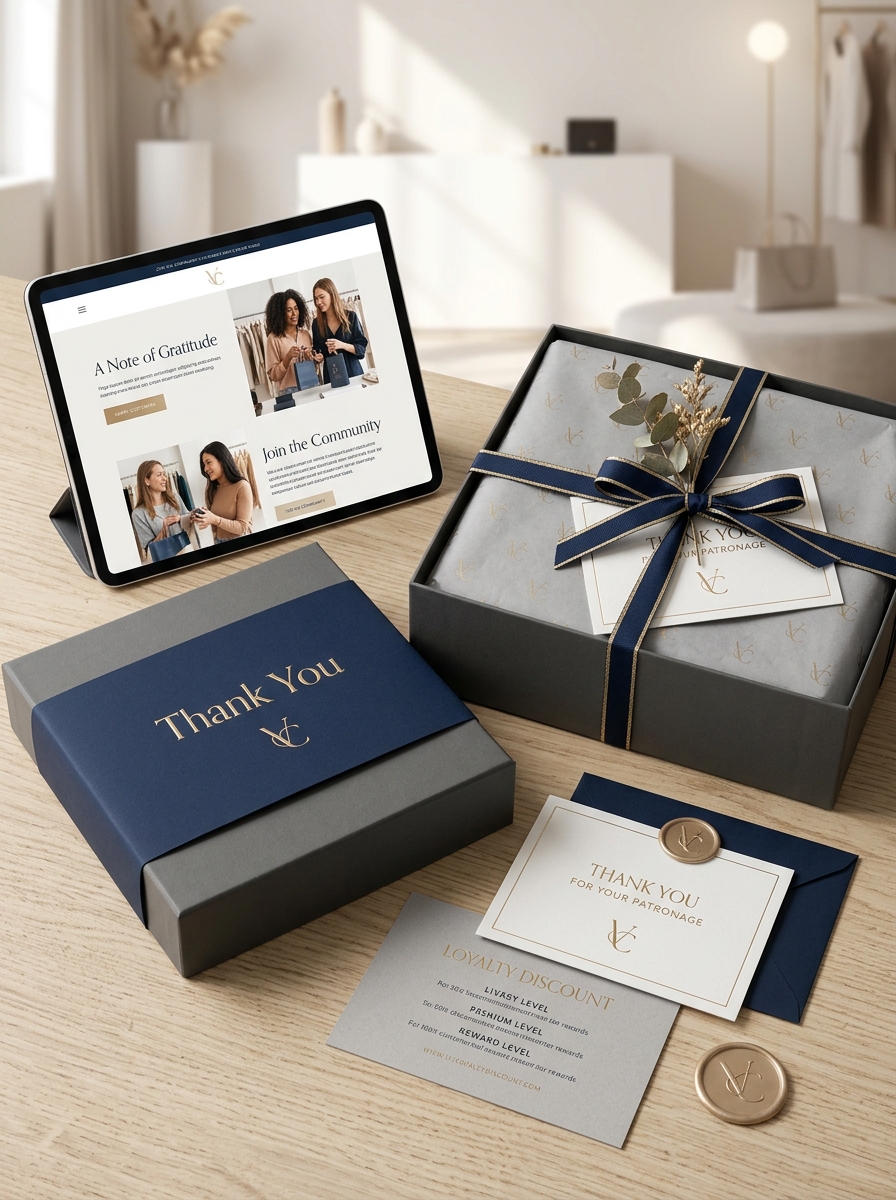
The unboxing journey has evolved into a critical touchpoint for brand storytelling and long-term customer retention. Mastering the visual impact of thank you packaging design transforms a standard delivery into an immersive sensory experience. By integrating strategic typography, premium textures, and personalized elements, brands can create an emotional resonance that extends far beyond the initial purchase.
Innovative packaging design concepts serve as a silent ambassador for your brand's identity. When a customer encounters a meticulously crafted "thank you" message or a cohesive aesthetic, it reinforces their buying decision and encourages organic social sharing. Focusing on these high-impact visual details allows businesses to differentiate themselves, ensuring the final physical interaction with the consumer is both memorable and influential. Elevating your presentation through intentional design is the key to building lasting loyalty and maximizing the perceived value of every shipment.
The Strategic Role of Gratitude in Brand Identity
In modern commerce, expressing gratitude is a sophisticated tool for shaping a cohesive brand identity. Far from being a mere social nicety, a well-timed "thank you" functions as a bridge between cold transactions and meaningful customer loyalty.
By strategically integrating appreciation into the customer journey, businesses humanize their presence, fostering emotional connections that differentiate them from competitors. Whether through personalized post-purchase emails or exclusive rewards, gratitude signals that a company values people over profits. This authenticity builds trust and transforms satisfied buyers into vocal brand advocates. Ultimately, a culture of appreciation reinforces a brand's core values, ensuring long-term retention and a positive market reputation in an increasingly automated world.
Psychology of Color for Memorable Thank You Messaging
The psychology of color plays a pivotal role in how gratitude is perceived and remembered. By strategically selecting hues for your thank you messaging, you can evoke specific emotional responses that deepen the impact of your appreciation.
- Blue: Instills feelings of trust, security, and professionalism, making it ideal for corporate gratitude.
- Green: Represents harmony and growth, fostering a sense of peace and long-term partnership.
- Yellow and Orange: These warm tones spark joy, energy, and optimism, perfect for friendly or casual acknowledgments.
- Red: Conveys passion and intensity, signaling deep, heartfelt appreciation.
Integrating these psychological triggers ensures your "Thank You" resonates on a subconscious level. Aligning color with your brand's voice creates a cohesive and memorable experience that strengthens recipient loyalty and emotional connection.

Typography Styles that Convey Sincerity and Brand Voice
Choosing the right typeface is essential for translating digital gratitude into an authentic human connection. To convey sincerity, script or handwritten fonts are highly effective as they mimic the personal touch of a manual note, fostering intimacy and warmth.
To align your "thank you" with your brand voice, consider these semantic styles:
- Serif Fonts: Project authority, tradition, and formal respect, ideal for professional acknowledgments.
- Sans-Serif Fonts: Communicate modernism, transparency, and straightforward honesty.
- Display Fonts: Express high energy and creative enthusiasm for bold, vibrant brand personalities.
The visual weight and letter spacing further influence perception. Lighter weights suggest elegance and grace, while generous kerning creates a sense of calm. Ultimately, purposeful typography ensures your message of thanks resonates as genuine and brand-aligned.
Tactile Luxury Through Premium Materials and Finishes
Expressing gratitude becomes an immersive experience through tactile luxury. By selecting premium materials, brands transform a standard "thank you" into a high-end sensory interaction. Utilizing heavy-weight cardstock and specialty papers provides a sense of substance and durability that digital communication cannot replicate.
Incorporating sophisticated finishes like soft-touch lamination, embossing, and metallic foil stamping adds physical depth and visual prestige. These tactile elements engage the recipient's sense of touch, reinforcing the perceived value of the gesture. When a thank-you note feels substantial and textured, it communicates a deeper level of appreciation and meticulous attention to detail.
Elevate your brand's storytelling by choosing substrates that resonate, turning every piece of correspondence into a tangible masterpiece of craftsmanship that leaves a lasting impression.
Eco-Friendly Packaging for Sustainable Appreciation
Expressing gratitude through eco-friendly packaging is a powerful way to align your brand values with environmental stewardship. When you choose sustainable materials to say "thank you," you transform a routine unboxing into a meaningful, eco-conscious experience.
Utilizing compostable mailers, recycled inserts, and biodegradable fillers demonstrates a genuine commitment to the planet. This approach to sustainable appreciation resonates deeply with modern consumers, fostering long-term loyalty and trust.
By reducing plastic waste and lowering your carbon footprint, your gesture of thanks becomes an authentic statement of care for both the recipient and the Earth. Choosing green solutions ensures your appreciation leaves a lasting emotional impact without leaving a permanent mark on the environment.
The Art of Minimalist Layouts in Gratitude Design
In the realm of gratitude design, minimalism serves as a powerful tool to amplify sincerity. By utilizing strategic whitespace and intentional typography, a minimalist "Thank You" note removes visual noise, ensuring the core message remains the primary focal point.
Adopting a minimalist approach involves several key principles:
- Visual Clarity: Stripping away non-essential decorations to highlight the sentiment.
- Structural Balance: Using an organized grid to create a sense of calm and professionalism.
- Limited Palette: Selecting a few cohesive colors to evoke specific emotional responses.
Ultimately, minimalist layouts transform a simple gesture into a sophisticated statement. By focusing on essential elements, designers ensure that the recipient's attention is captured by the warmth of the appreciation rather than complex graphics.
Elevating the Unboxing Experience with Personalized Details
The unboxing process is a critical touchpoint in the customer journey, serving as the physical bridge between a digital transaction and brand loyalty. By incorporating personalized details-such as handwritten "thank you" notes, custom inserts, or tailored product suggestions-brands can transform a standard delivery into a memorable brand experience.
These thoughtful gestures demonstrate genuine appreciation, fostering a deeper emotional connection with the consumer. In a competitive marketplace, tactile personalization stands out, encouraging social sharing and increasing customer retention. Elevating the unboxing experience doesn't just deliver a product; it communicates value and makes the recipient feel seen. By focusing on these intricate details, businesses successfully turn first-time buyers into lifelong brand advocates through the power of a simple, personalized "thank you."
Visual Storytelling Through Custom Illustrations and Graphics
Thank you for choosing us to bring your brand's narrative to life. We believe that custom illustrations and bespoke graphics are more than just decorative elements; they are vital tools for effective visual storytelling. By translating complex concepts into unique, engaging imagery, we help you forge an authentic connection with your audience.
Your trust allows our creative team to push the boundaries of design, ensuring every pixel and line artfully conveys your message with clarity and impact. We appreciate the opportunity to enhance your project through purposeful design and artistic excellence, creating a memorable digital experience that stands out in a crowded marketplace.
Harmonizing Brand Consistency with Festive Thank You Elements
Achieving a balance between brand identity and holiday cheer is essential for professional seasonal communication. When crafting festive "Thank You" messages, businesses must integrate celebratory elements without compromising their core visual and verbal identity.
- Visual Alignment: Infuse seasonal colors and imagery that complement, rather than clash with, your primary brand palette and logo.
- Tone Consistency: Ensure the expression of gratitude remains authentic to your established brand voice while embracing seasonal warmth.
- Subtle Iconography: Use minimalist festive motifs that enhance the message without overshadowing professional layouts.
By strategically blending holiday themes with established brand assets, companies reinforce recognition while building emotional connections. This cohesive approach ensures your gratitude feels both sincere and professionally grounded, strengthening customer loyalty through a unified brand experience.
Future Trends in Interactive and Digital Packaging Gratitude
The landscape of consumer appreciation is evolving through interactive and digital packaging innovations. Brands are increasingly moving beyond static notes to leverage Smart Packaging technologies such as QR codes and NFC tags. These tools allow customers to access immersive "thank you" experiences, including personalized video messages and exclusive digital rewards.
Emerging trends highlight Augmented Reality (AR) as a key driver for customer engagement, transforming traditional unboxing into a dynamic brand story. By integrating digital gratitude, companies enhance user experience (UX) and foster brand loyalty while maintaining sustainability by reducing paper waste. From gamified appreciation to blockchain-verified loyalty tokens, the future of packaging lies in creating a seamless, high-tech connection that makes every purchaser feel uniquely valued.
Leave a comment